No products in the cart.
LFD Group – Brand Identity Case Study
About LFD Group:
Founded in 2021 by Mohammad H. Naqi, LFD Group is a Kuwait-based food and beverage holding group with a vision to deliver exceptional dining and coffeehouse experiences across the GCC. Founded in 2021, the group owns a family of distinctive brands in Kuwait and GCC — Cro Bakery, Eat Softie, Dice Donuts, and Lawa — that are each celebrated for innovation, quality, and meticulousness.
From classic pastries to innovative coffee concepts, LFD Group blends local heritage with global standards. Every brand in its stable is inspired by the same ethos: to turn the finest ingredients into perfect moments to share with friends and loved ones.
Brand Attributes: Craftsmanship | Consistency | Innovation | Warm Hospitality | Design-Driven | Family Focused
My Role:
Being the brand designer, I developed LFD Group’s entire visual identity system — from logo design and type to color, applications, and online presence. The goal was to create a timeless, yet modern visual system that unites the group’s diverse brands under one strategic look.
Brand Naming:
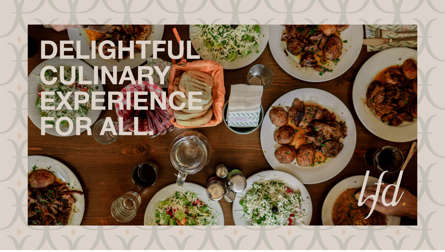
LFD stands for Love. Food. Drinks.
Three simple words to describe the group — people, passion, and warmth:
Love is at the heart of every brand — true hospitality, committed team members and tailored care in every contact.
Food is a canvas for creativity and handiwork — from Cro’s signature pastries to Dice Donuts’ playful concoctions, and Lawa’s modern plates.
Drinks, to finish the picture — the shared moments at Softie, laughter over lattes, that feeling of belonging that captures LFD’s culture.
Draft & Iterations:
Visual Identity:
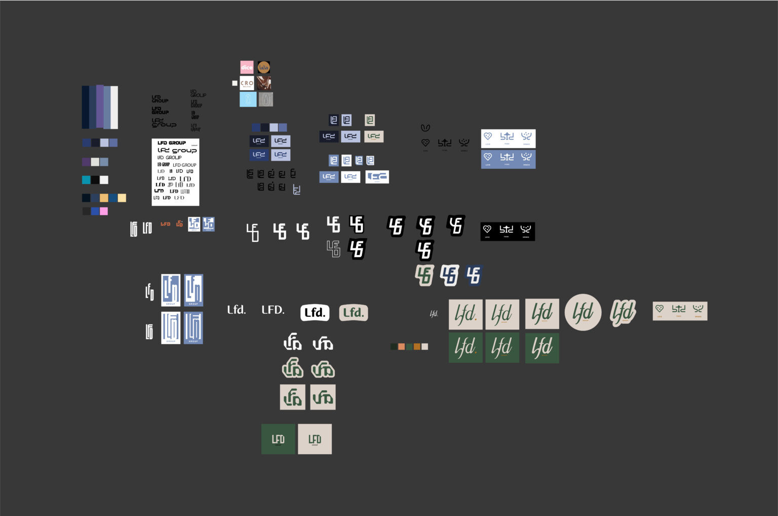
The logo was designed as a clean, bold wordmark with geometric letterforms representing precision and modernity. The interlocking letter “LFD” structure symbolizes collaboration among the group’s brands.
Color Palette:
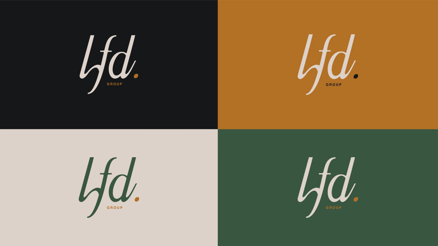
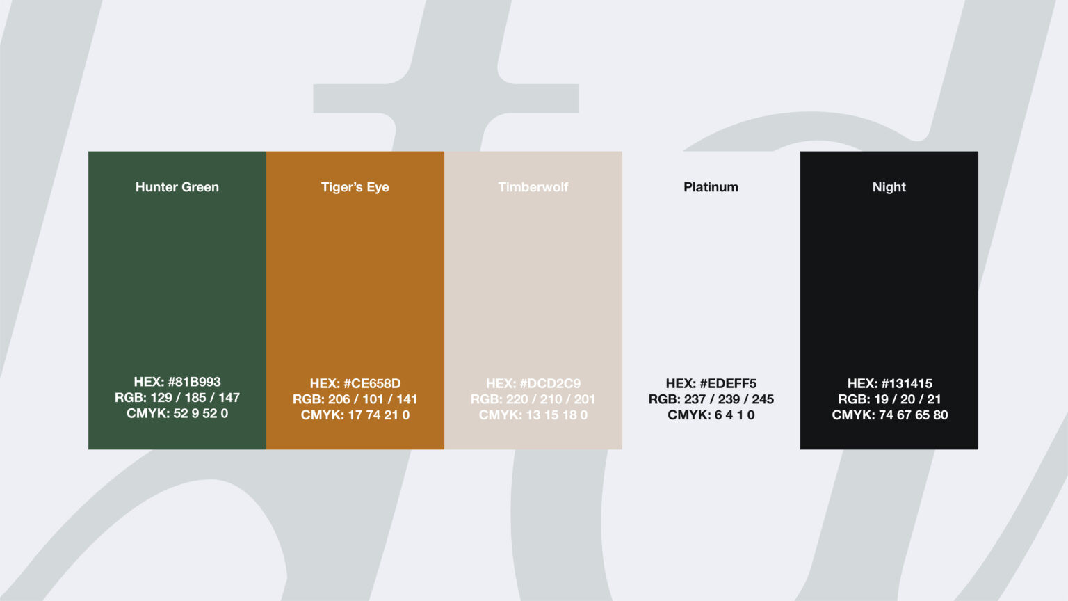
By combining earthy tones with sophisticated neutrals, the LFD Group color palette portrays both contemporary workmanship and organic warmth. Every colour has a distinct function: it communicates depth, balance, and trust. The group’s emphasis on realistic design and actual ingredients served as inspiration for this design.
Brand Typography, Patterns & Iconography:
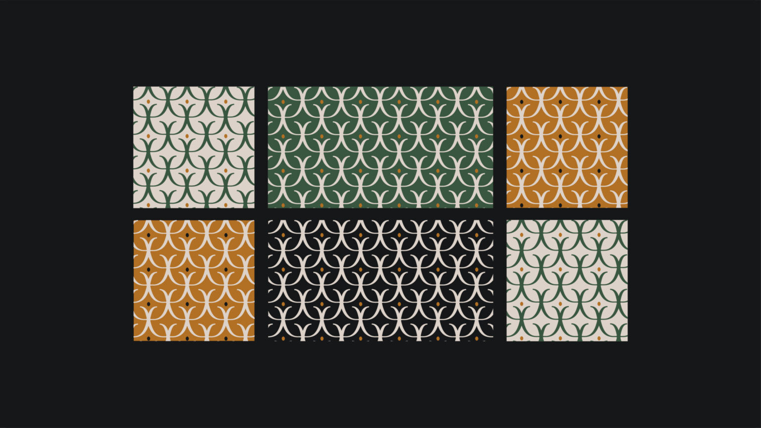
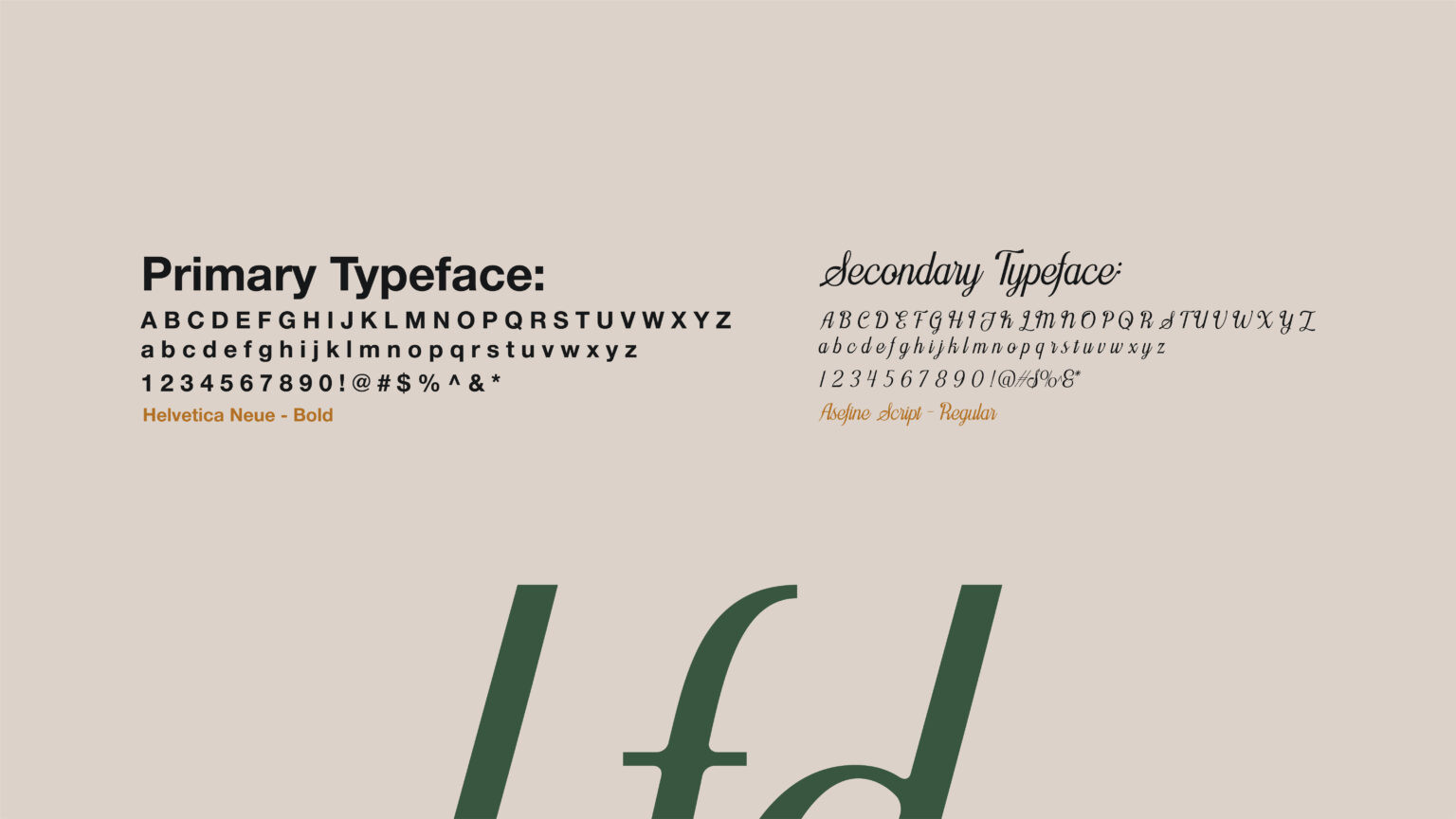
The LFD Group icon system brings the philosophy of Love, Food, and Drinks to life through timeless, minimal forms. Each mark was crafted using the same geometric rhythm and organic curvature — ensuring visual harmony across every brand expression.
Digital & Print Applications:
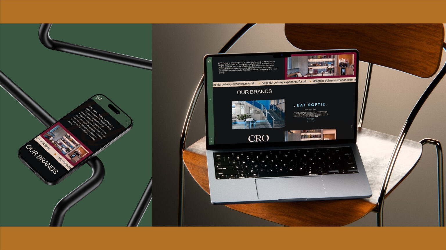
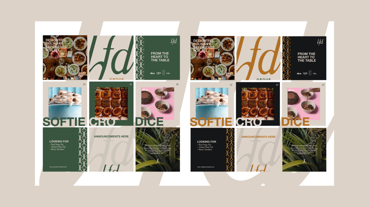
The LFD Group visual identity came alive on digital and physical touchpoints — reflecting the brand’s balance of craftsmanship and modern hospitality.
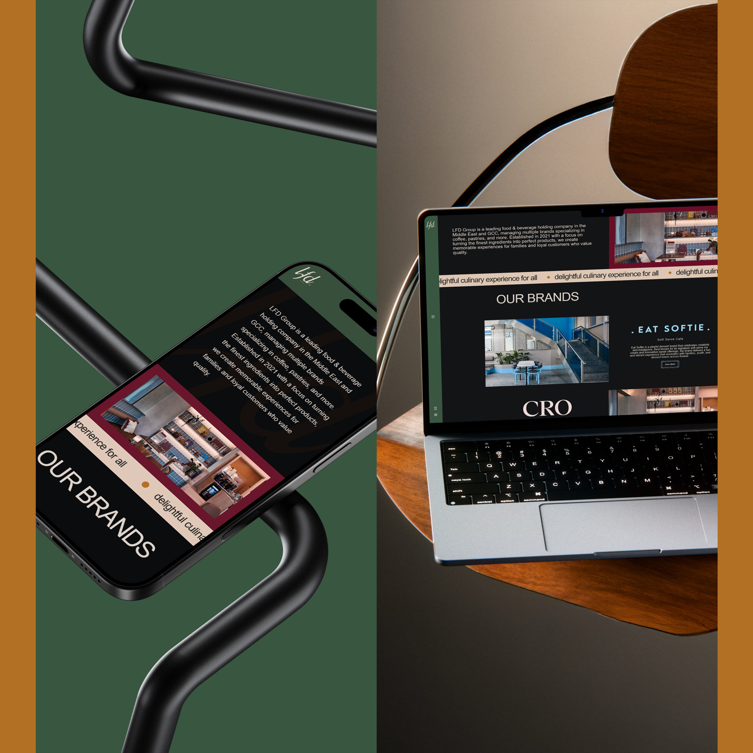
I developed the corporate website and social media content system, which was designed to give all touchpoints a consistent tone and appearance. The focus was on creating a seamless dialogue between the group’s online presence and its in-real-life experiences.
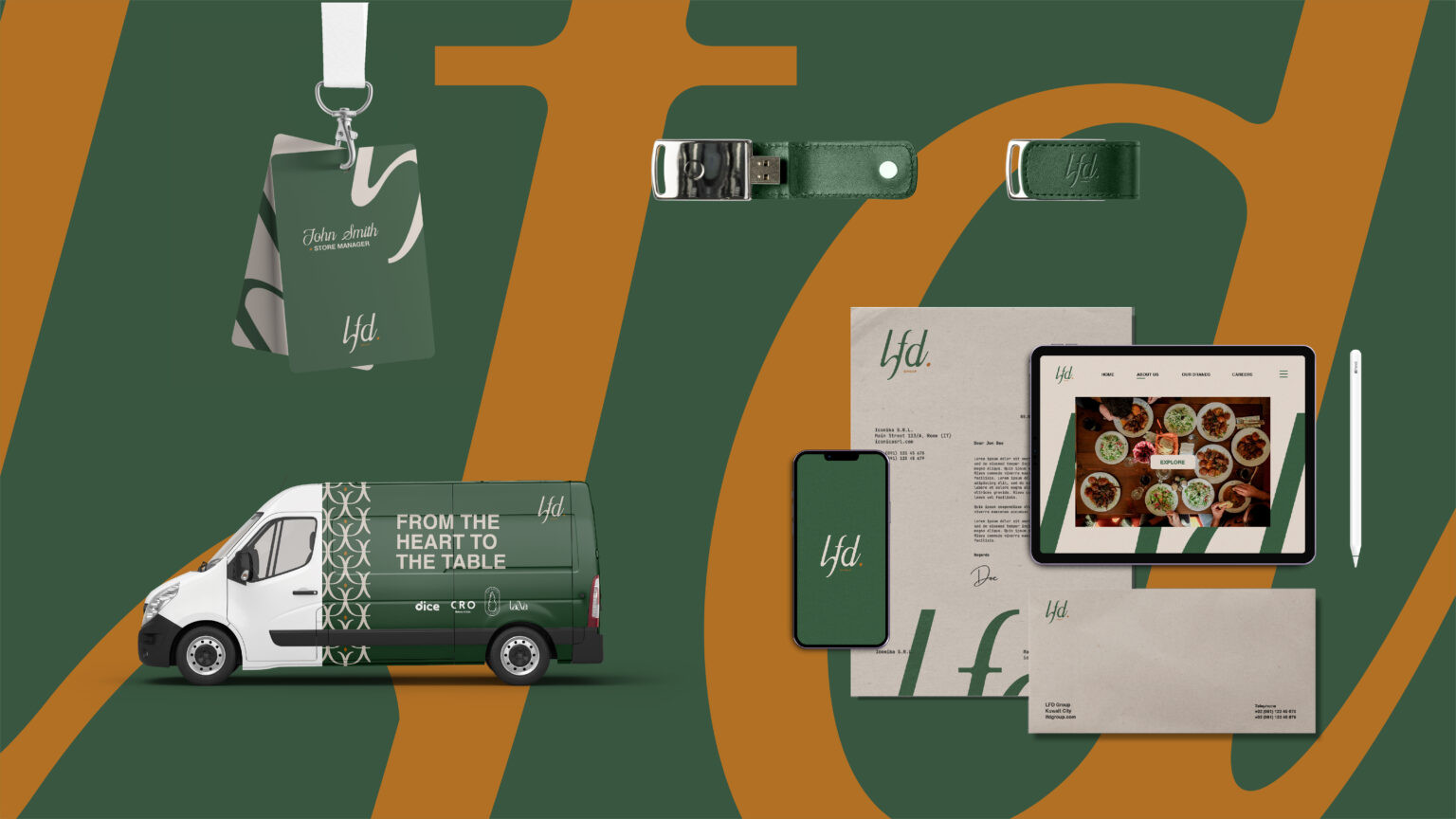
The LFD Group project shows how thoughtful design can bring together diverse F&B concepts under one shared story. Each brand — from Cro Cafe’s buttery pastries to Dice Donuts’ playful desserts, Eat Softie’s cozy coffee moments, and Lawa’s modern delightful take on Baklavas.
At the heart of it all is Mohammad H. Naqi, the owner and founder of LFD Group — someone whose belief in genuine hospitality and creative collaboration turned a collection of brands into a unified and delightful culinary experience for all.



Leave a Reply